Branding elements
Elements are the primary building blocks of matter. Think back to chemistry class—remember the periodic table of elements? All those squares with numbers and two-letter symbols? This is relevant to branding, trust me. Everything in the universe is made up of some combination of these elements. Similarly, every brand out there is made up of the same elements of branding, like a logo, a color palette, a specific user experience and more.
These branding elements come together to form a brand identity, which our designers then use to craft com-pelling, engaging brand designs. Here’s everything you need to know about the elements of branding and how to use them successfully.
Typography
Typography refers to—the font (or type) you choose for your branding materials. It’s particularly important to choose logo fonts and brand fonts wisely. There are four major types of typography:
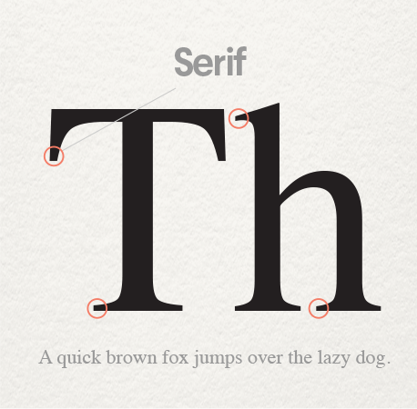
- Serif fonts (like Times New Roman or Garamond) have what look like an anchor (or to some people, little feet) on the end of each letter. This classic typography is great if you want your brand to appear trustworthy, traditional, and just a little old school.
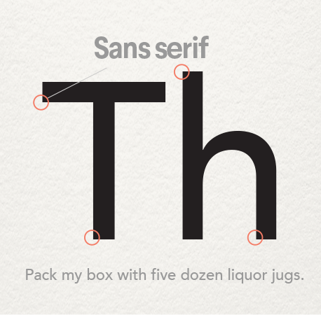
- Sans serif fonts (like Helvetica or Franklin Gothic) are letters that have smooth edges and lack the anchor or “feet” of their serif counterparts. Sans serif fonts give a more sleek, modern feel to brands.
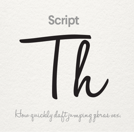
- Script typography emulates cursive handwriting (so much for all those cursive lessons in elementary school!). These fonts (like Allura or Pacifico) can be a great way to add a luxurious or feminine feel to your brand.
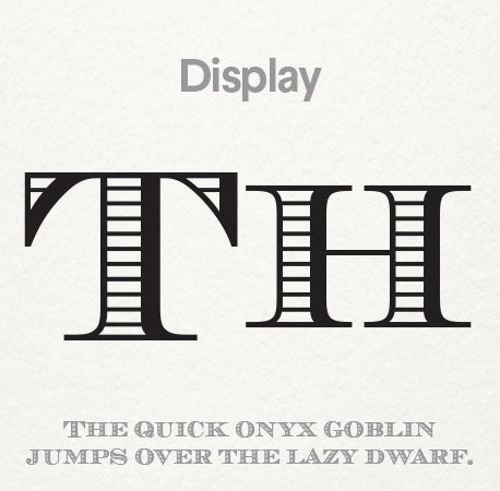
- Display fonts are kind of in a league of their own. Each display font has a specialized element, whether it’s an unusual shape to the letters, outlines, shadowing, or a more artistic/hand-drawn edge (think Metallica’s lightening bolt font). Want to make a bold statement and create a brand identity people won’t soon forget? A display font is a great way to do it.
Color Palette
People—your potential customers included—have psychological ties to different colors, and using branding colors and logo colors strategically can have a serious impact on how your brand is perceived by your audience.
- Red: Red is the color of passion and excitement. It’s the perfect choice if your brand identity is loud, youthful, and exciting.
- Orange: Orange is another high-energy color and is great if you want to appear friendly and playful. It’s used less commonly than red, so will also make you stand out.
- Yellow: Yellow, the color of sunshine, is all about happiness. The cheerful vibe makes it a good choice if you want to feel fun, accessible and affordable.
- Green: An incredibly versatile color, green can be used for just about any brand. Culturally, though, when people see green, they think two things: money or nature. If your brand is tied to either of those things, green is an especially good choice.
- Blue: The most universally appealing color in the spectrum, blue can help your branding to appear more stable and trustworthy, so if you’re looking to appeal to a wide demographic—and get them to trust you in the process—go with blue.
- Purple: Purple is the color of royalty, so if you’re going for a luxurious feel in your branding, this a safe bet.
- Pink: Right or wrong, pink is culturally tied to femininity, so if your brand is targeted towards women, pink should be a definite contender for your brand color. It’s also a great color for brands with a soft or luxurious identity.
- Brown: Brown is perhaps the least use color in all of branding, but that could actually work to your advantage! Any time you do something different, it helps you stand out. Brown can also help people to view your brand as rugged or masculine.
- Black: If you want to be viewed as modern or sophisticated, there’s nothing as classic and effective as black.
Can YOU guess the brand by COLORS?
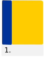
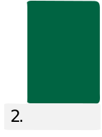
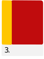
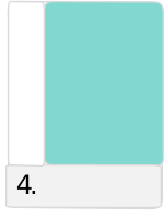
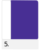
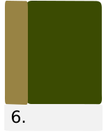
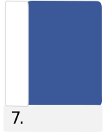
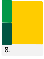
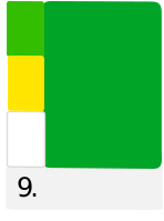
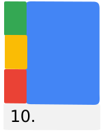
1. IKEA 2. STARBUCKS 3. MCDONALDS 4. TIFFANY&CO 5. CADBURY 6. HARRODS 7. FACEBOOK 8. SUBWAY 9. BP 10. GOOGLE
Form/Shape
Shape is another part of an overall branding strategy. Not just the shapes present in your logo, but the shapes in your web page backgrounds, layout design, packaging and even your business cards and other stationery.
Here’s how different forms can shape your brand identity:
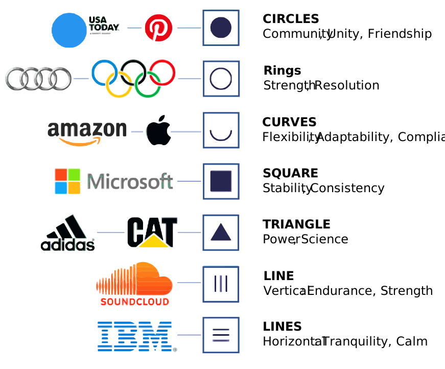
- Round shapes—like circles, ovals, and ellipses—are all about the warm and fuzzies. Brands that incorporate round shapes can create feelings of community, unity and love. The rounded edges can also be viewed as feminine.
- Straight edged shapes—like squares, rectangles, and triangles—make people think strength and efficiency. The no-nonsense lines create a feeling of stability and trustworthiness, but you need to be careful: if the shapes aren’t balanced out with something fun, like dynamic colors, they can feel impersonal and fail to connect with your customers.
- Straight lines also have their own implications: vertical lines suggest masculinity and strength while horizontal lines suggest tranquility and mellow vibes.
Logo
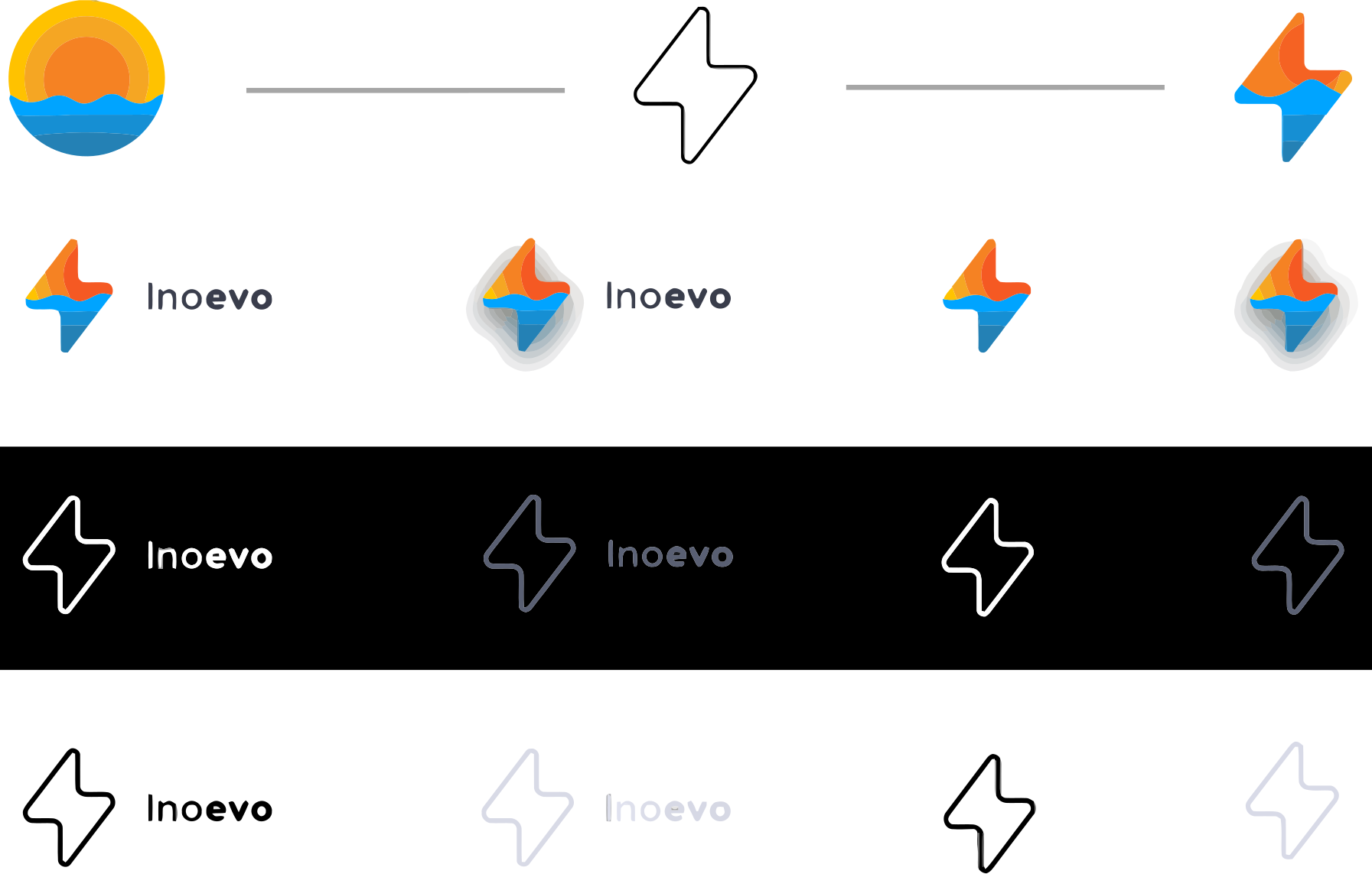
Your logo design is the cornerstone in your brand identity. When working with your designer, you want to aim for your logo to tick off the following boxes:
You also want to make sure that your design partner delivers your logo in multiple formats (like a black and white version or multiple sizes) to ensure you always have the logo you need—and that each is in line with your brand identity.
Website Design
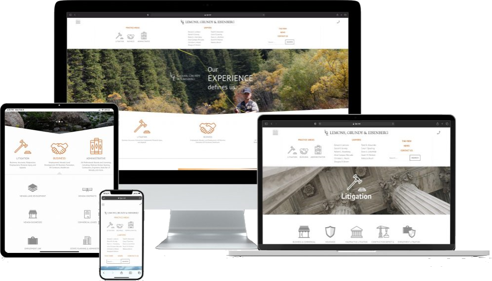
Your website is one of the most representative aspects of your brand identity. Especially if you’re running an online business or a digital product, your customers will definitely check your website out before deciding to do business with you. Your website is where your brand identity should come through in full force. Here are some important features any website should include:
- A Simple, Easy to Remember URL: If you are a new business, one without a website, you may be excited to get one up and running as soon as possible. But make sure you do the research and take a calculated approach when it comes to deciding on a URL. Consider your business goals and make sure whatever you choose is memorable. A few guidelines: Simple is better; the URL should be marketable and easy for users to type into their browser's address bar. Also, a good rule of thumb: Stick with .com or .org web addresses whenever possible. These are considered more credible by users and by search engines.
- A Clear Description of Your Business: If users stumble across your website, you need to make a good first impression and clearly communicate to them why your website exists in the first place. Who are you and why are you here? Make sure your homepage contains some kind of mission statement or hero message that summarizes what your business does.
- Call to Actions: Having a website is good. Getting people to that website is better. But getting those visitors to convert into actual purchases or leads is really what matters in the big picture. In order to do that, you need to be blunt about the action you want them to take after they land on your webpage. That might mean making a purchase, submitting a contact form, or even subscribing to a newsletter. Whatever it is you want visitors to do, tell them through carefully crafted call to actions.
- Contact Information: This may seem obvious, but do not forget to place your business name, address and phone number in the footer of your website. Users who scroll down to the footer are on a mission to find this information about your business. Just as readers know to flip to the back of a book for an index or glossary, they too understand that the best place to find contact information on a website is within the footer.
- Mobile Friendly or Responsive Design: So many people rely on their phones and tablets to access the web. This means, if you are going to design a website for your business, you pretty much have to make sure that it will display nicely on smaller screens. Making this a priority means you are providing top-notch customer service to your mobile and desktop visitors. And a bonus? It can give you an advantage as far as search rankings go.
- Staff Photos and Biographies: Consumers don’t just want to know what you do. They want to know who you are. Your website is a place where you should be marketing yourself, and in a world full of automation, people crave a personal connection. Additionally, pairing credentials with a face gives consumers a sense of trust, which is something everyone wants when money is being exchanged.
Social Media Ad Design
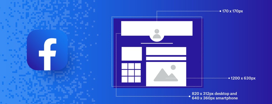
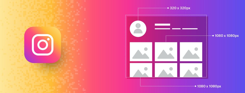
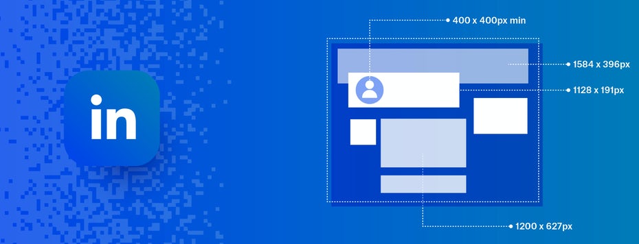
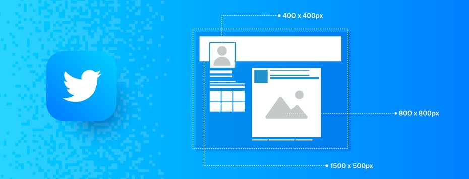
Social media is an ever growing platform with billions of active daily users. We all know that ads must appeal to the masses, and those masses are on social media. It’s no surprise that advertising on theses platforms has become a popular and booming industry. Just like Google has done with AdWords, social media companies have established rules and regulations on how their ads should be written, designed and displayed.